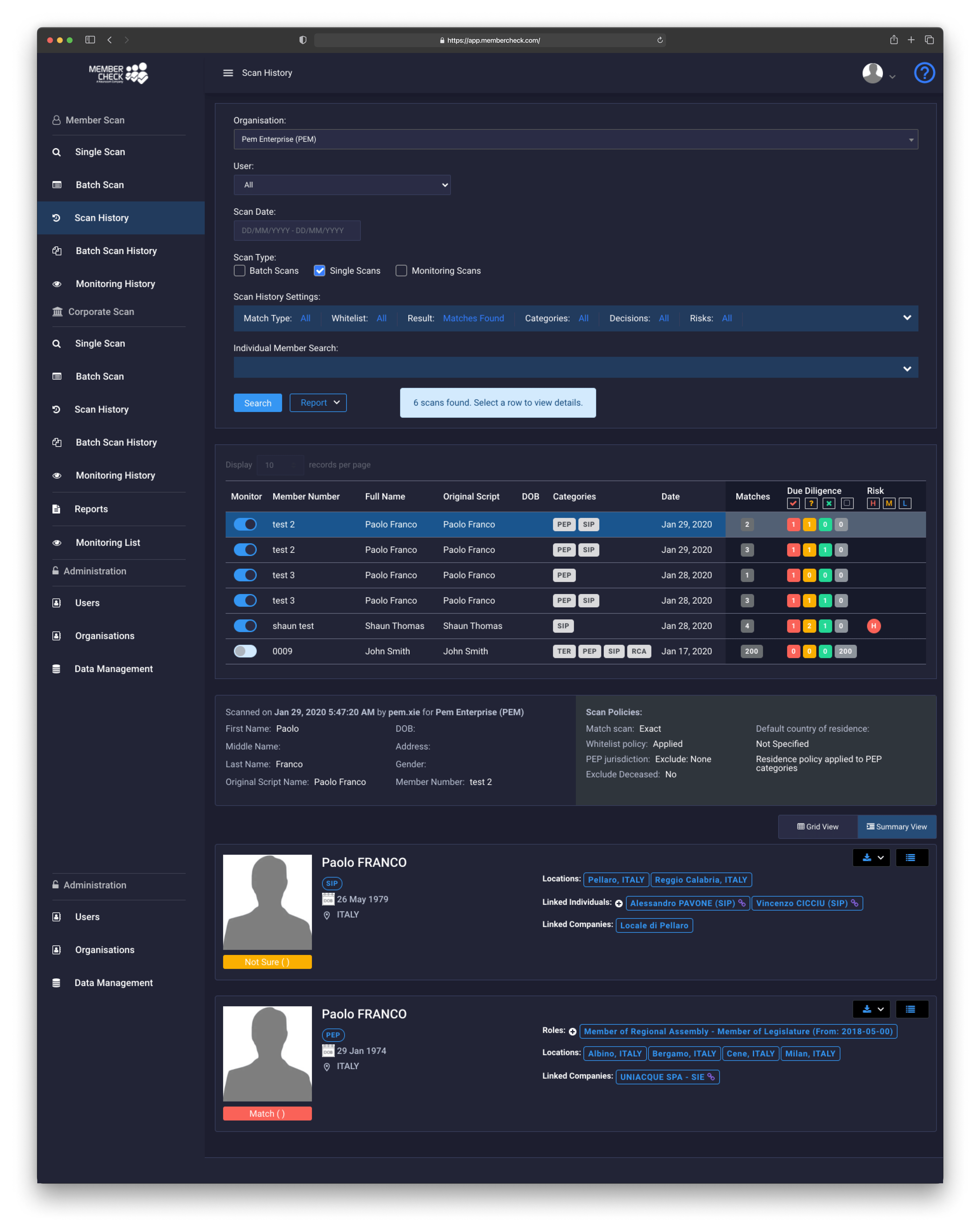
MemberCheck - IDV Feature & UX Enhancement

All-in-one compliance solution.

Project tools
Figma

Adobe Illustrator

Team
2 Product Designer

1 Product Manager

3 Developers

1 Compliance Officer
mY Deliverables
End-to-end Product Design
Project Duration
6 Months

Project Overview

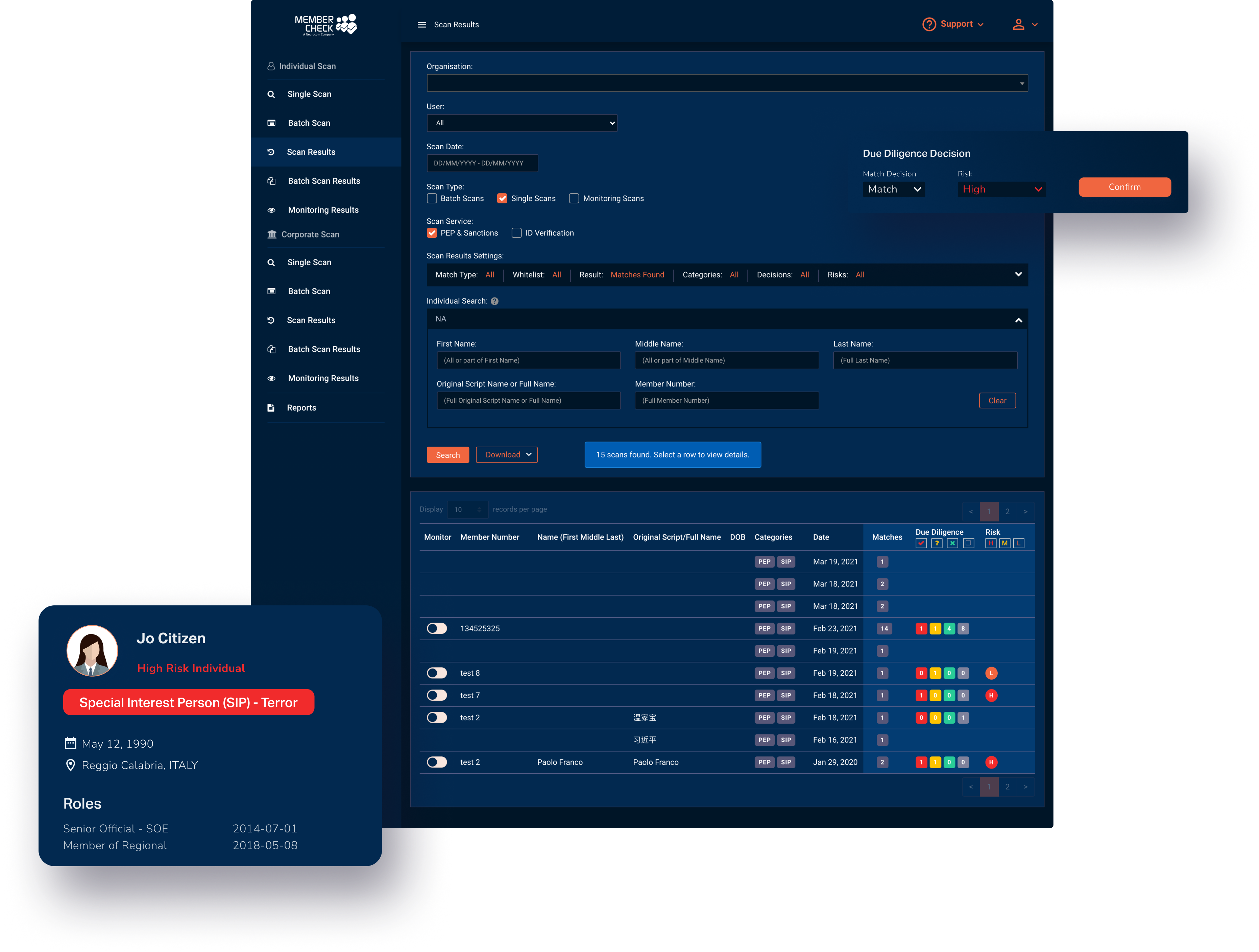
The Product - Compliance Solution

  • B2B SaaS Web Application: Cloud-based platform for risk management.
  • Core Feature : Checks for politically exposed persons, sanctions, and adverse media, with ongoing risk monitoring.
  • Use Case Example : MemberCheck helps compliance officers screen Russian clients, verify identities, detect risks, and ensure anti-money laundering and identity compliance.

Project Overview

The Problem

01No ID verification feature

Based on feedback from the sales team and our AML consultant, we believe the new ID Verification feature can make our application more competitive in the market.

02Old school User interface

Design trends and user feedback suggest updating MemberCheck's visuals, which haven't been refreshed in a decade.

03Complex Workflow

Feedback shows that complex fields are a challenge for users with varying experience levels.

04Inability to perform all MemberCheck's solutions all together at once

Design Process

My design process wasn’t always linear; sometimes, I built on existing work and jumped between stages due to time, resource and technical constraints.

01

Understand

Conduct the user research to understand the user's needs

02

Define

Identifying the problem and brainstorming with my team

03

Ideate

Hypothesise the question and create potential solutions

04

Validate

Use insights from analytic tool to refine the solutions and improve.

Understand the User

User Interview

We ran user interviews to get a better feel for how people use the design and tackle key tasks. We analysed the results to spot common behaviours, needs, and pain points, which helped us build user personas.

Study type

User Interview

Location

Australia wide   |   Remote

Participants

5 people

Length

30mins each

Purpose

Understand the users and use the insights to create personas

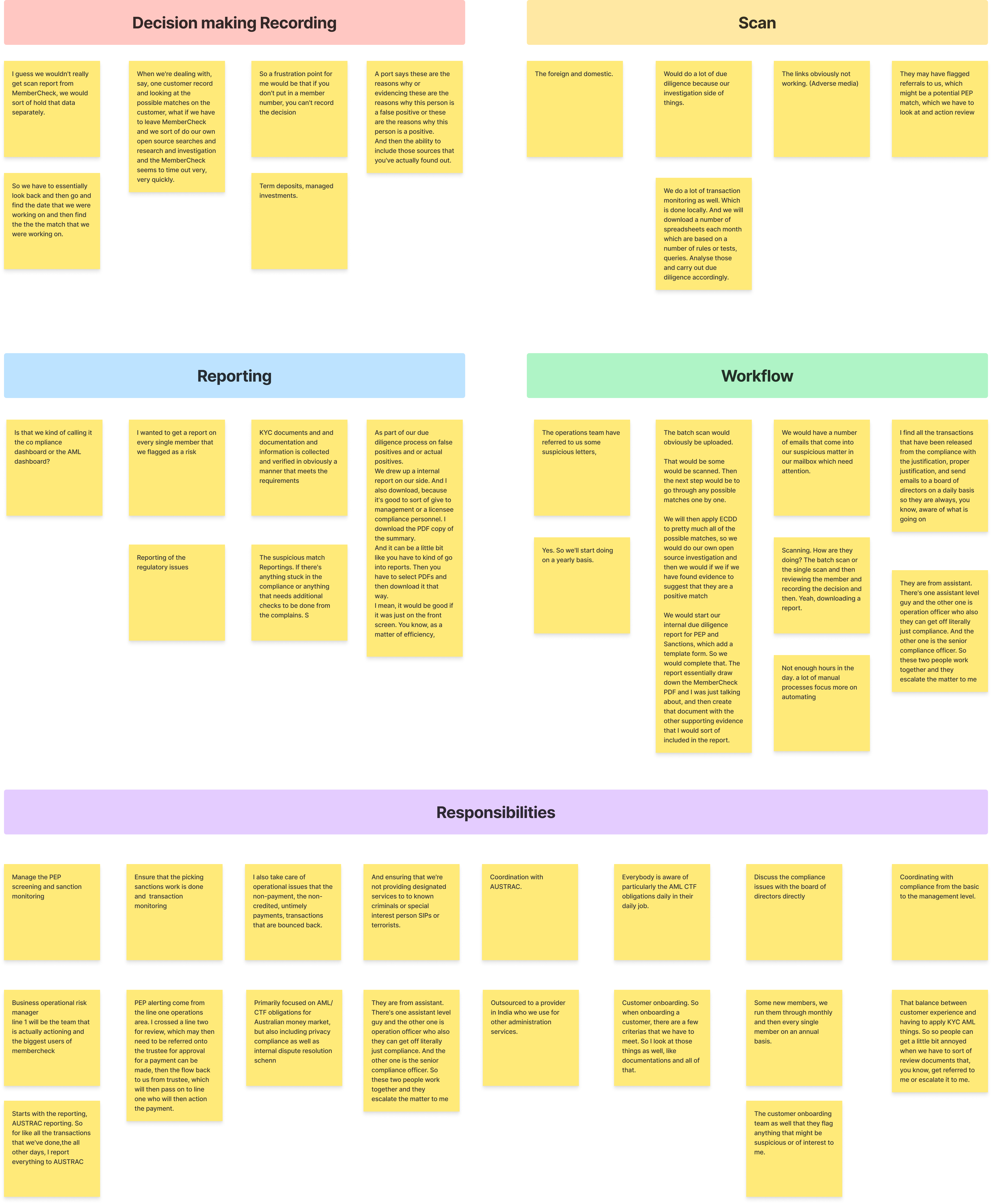
Affinity diagram for
User Interview

After conducting user interviews, we organised the research data and observations into related groups using an affinity diagram. This method helped us identify common themes and patterns, which provided actionable insights.

Key Insights

In summary, based on the interview, MemberCheck can focus on improving data accuracy and automating tasks. While this does not provide a clear direction for solving the outlined issues mentioned earlier, it highlights the other priority areas where MemberCheck can make impactful enhancements.

Understand the User

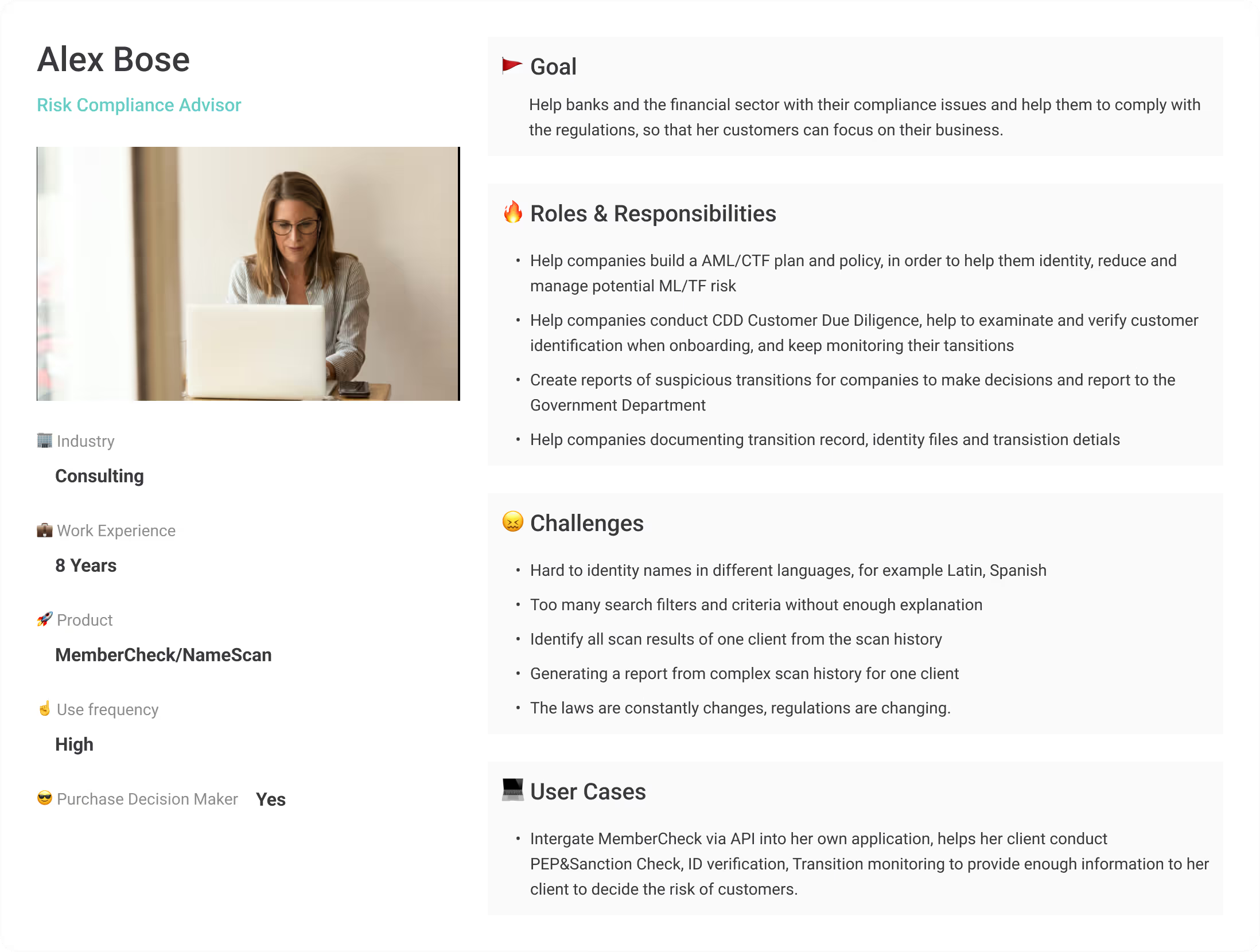
Persona

At the project's start, we created three personas from user interviews. Working with the product, marketing, and sales teams, we used these personas to identify core problems and understand user pain points.

Key Insights

01 Diverse Roles, Shared Goals

02Different Experience Levels

03Each persona has unique, distinct pain points

Understand the User

Journey Through the Product

I then created a journey map to analyse interactions between the MemberCheck user and the product, illustrating how a compliance officer performs a scan. This process helped me empathise with users, highlight frustrations, and spot opportunities for improvement.

Key Insights

Feature Enhancements: Add ID verification, update the UI, and include tooltips and guided navigation to make the system easier to use.

Data Accuracy: Ensure reliable scan results and use up-to-date data sources to minimise false positives and missed alerts.

Decision Support: Provide targeted help during the Escalate stage, such as explanations of risk factors or suggested next steps, and automate repetitive tasks to improve efficiency.

Understand the problem

Usability Interview

We are conducting usability interviews to address challenges related to security, onboarding, accessibility, performance, navigation, functionality, task completion, and workflow efficiency. These insights will inform improvements to MemberCheck’s classic UI and outdated workflows, delivering a more user-friendly and seamless experience.

Study type

Usability Interview

Location

Australia wide   |   Remote

Participants

5 people

Length

30mins each

Purpose

Usability testing helps us identify pain points in the current MemberCheck application experience.

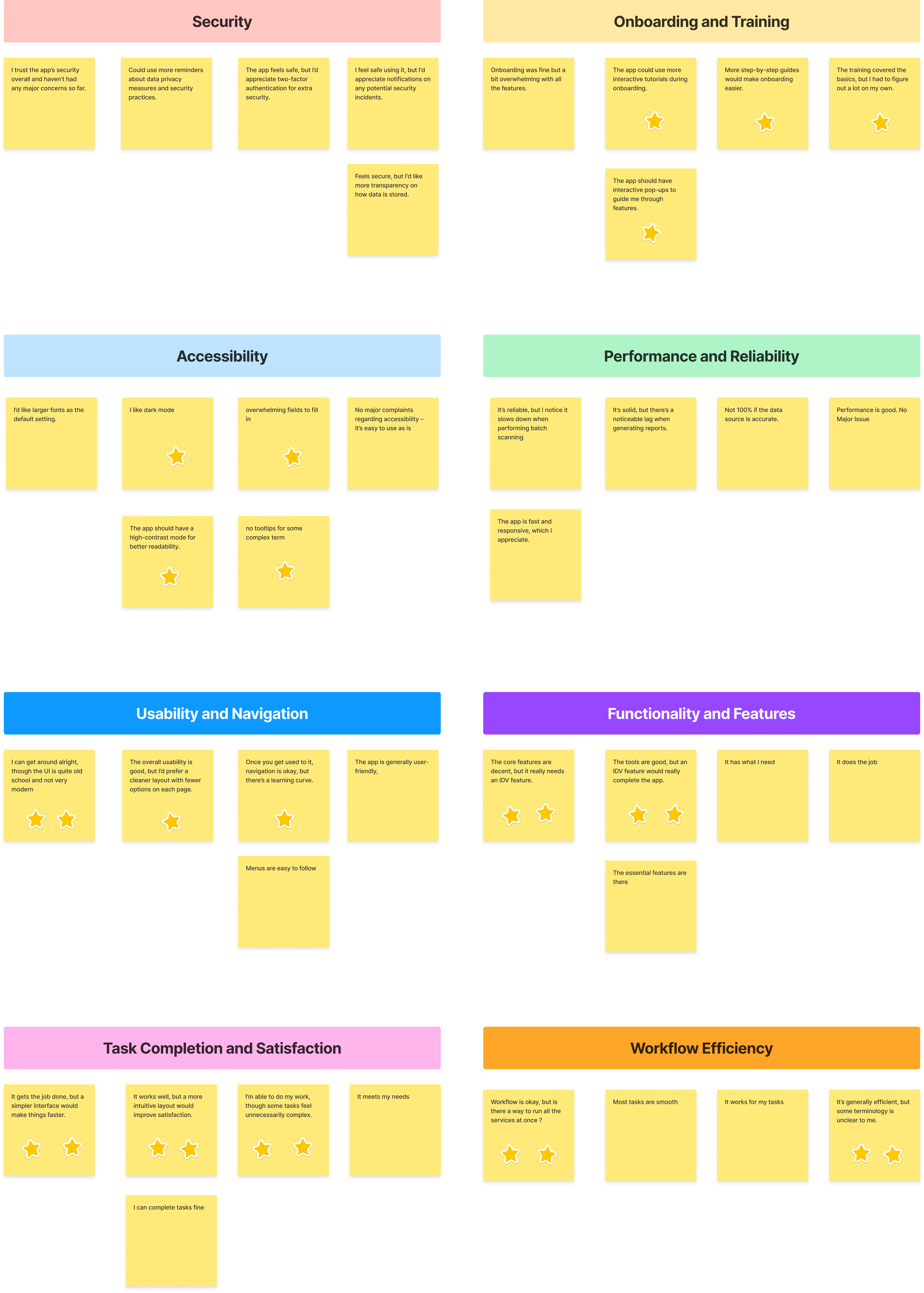
Affinity Diagram for
Usability Interview

After usability interview, we used an affinity diagram to group related data and observations. This method helped us spot common themes and patterns, leading to actionable insights.

Key Insights

In summary, based on the interview, MemberCheck can focus on improving data accuracy and automating tasks. While this does not provide a clear direction for solving the outlined issues mentioned earlier, it highlights the other priority areas where MemberCheck can make impactful enhancements.

Key Insights

Security: Users feel safe but want clearer data handling and security tips. Adding two-factor authentication was frequently suggested.

Onboarding & Training: Some find it overwhelming. Step-by-step guides and interactive tutorials could help.

Accessibility: Requests include larger fonts, dark mode, and improved form design. Text size and contrast customization would enhance accessibility.

Performance & Reliability: Generally good, though some report slowdowns with large reports. Real-time feedback or progress indicators would help.

Usability & Navigation: Navigation is fine once familiar, but the UI feels outdated. A modern, intuitive design could aid new users.

Functionality & Features: Core features work well, but users want more automation for repetitive tasks.

Task Completion: Tasks are completed, but some feel unnecessarily complex. Streamlining workflows could improve satisfaction.

Workflow Efficiency: Overall efficient, but users want better integration with other tools and smoother workflows.

Understand the workflow

IDV Workflow

After discussing with our third-party vendor, product manager, and developers, we understand that there are two IDV (Identity Verification) workflows.

There are two workflows for Identity Verification (IDV):

Customer-initiated IDV: The user enters the email or SMS of the person to be verified. A link is sent to the customer, who completes the ID verification. Results are then displayed on the application dashboard.

User-initiated IDV: The user enters another person's ID information, email, and phone number. Results are then displayed on the web application dashboard.

Understand the workflow

Fields Assessment

In Member Check’s existing compliance workflow, it is crucial to identify the mandatory fields necessary for performing checks on Politically Exposed Persons (PEP), Sanctions, and ID Verification.

Key Insights:

We have analysed each required & optional field and assigned it a visual hierarchy level—High (H), Medium (M), or Low (L).

This classification will guide the placement of these fields in the UI during later design stages.Additionally, we pre-defined the UI type for each field, determining whether it should be a dropdown, text field, checkbox, or radio button to enhance user interaction and data entry efficiency.

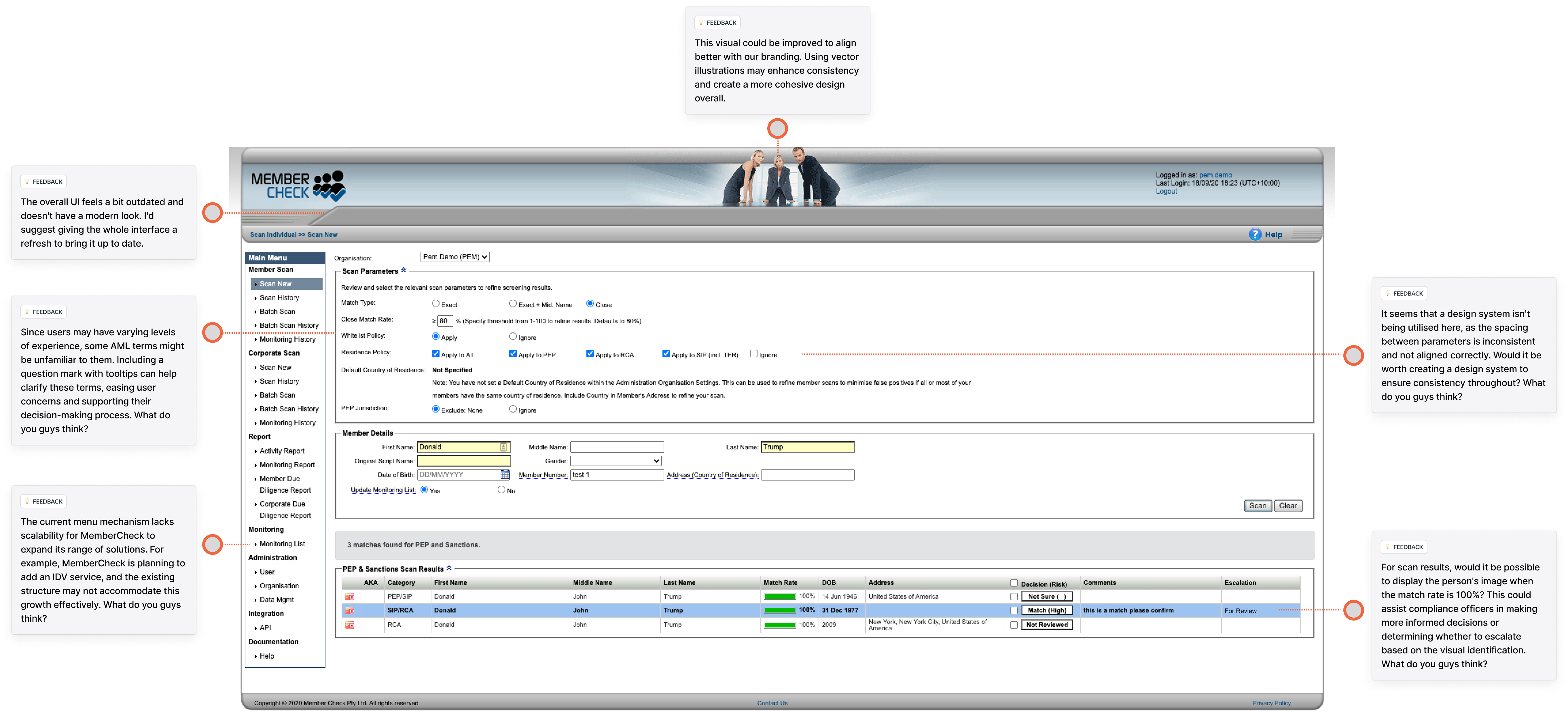
Design cruitique on production

Overall Production Design Critique

This critique evaluates the production design's effectiveness and identifies opportunities for improvement. It focuses on assessing how well the design performs in context and explores ways to enhance its impact.

Major Feedback

01 No Scalability

02Confusing AML terms with no guidance

03Too many fields can overwhelm users

04Out-dated Visual

STARTING THE DESIGN

Design System

I defined a design system for MemberCheck’s application to ensure a consistent, user-friendly experience across all interfaces. Its flexibility allows for easy integration of reusable components, enabling quick adaptation to changing needs.

STARTING THE DESIGN

Design Principles I followed

Design Principles: I focused on minimalism, consistency, and guided navigation to ensure a simple and user-friendly experience.

Minimalism

I believe in clear, simple design. My philosophy is to create intuitive and efficient interfaces by focusing on essential functions and maintaining a minimalist style. This reduces clutter, sharpens focus, and makes our system user-friendly, encouraging swift adoption.

Consistent

I ensured a cohesive design by adhering to a design system, using consistent styles and components throughout the interface to provide a unified and predictable user experience.

Guideded navigation

I implemented clear navigation cues and step-by-step instructions to guide users seamlessly through their journey, enhancing ease of use and reducing confusion.

STARTING THE DESIGN

Applying UX Laws

I reviewed key UX laws, which are best practices for creating user interfaces. Applying psychology in design clarified user expectations, enhancing the overall experience.

Miller’s Law & Progressive Disclosure

Miller’s Law states that people can process only 7±2 items at a time. To apply this, group related options and use progressive disclosure to present information in smaller, manageable chunks.

Possible implication in the UI: Since the classic UI displays all fields on one page, which can overwhelm users, we can improve UX by breaking the form into steps and using a card layout to progressively disclose fields, making the process more manageable.

Hick’s Law

This law suggests that the more choices people have, the longer it takes to decide.

Possible UI implication: Categorise or limit options shown at once, using filters or toggles to help users focus and display fields only when a checkbox is checked, revealing relevant info as needed and reducing distractions.

Goal-Gradient Effect

The Goal-Gradient Effect suggests that as people get closer to completing a task or reaching a goal, their motivation and effort increase.

Possible UI implication: To apply this in design, show progress and encourage users with visual cues or rewards that push them toward completing the task.

STARTING THE DESIGN

Hypothesis

After gathering insights from personas, user interviews, usability tests, and the user journey map, we formed a hypothesis that this approach will solve user pain points and improve the UX.

We believe the following will resolve user pain points and improve UX.

01ID Verification Feature is a must

We think a modern, simpler UI will make identity verification easier to understand, strengthen the brand, and build trust with users.

02 UI/Visual Design Improvement

We assume that a modern, simpler UI will make identity verification easier to understand, strengthen the brand, and build trust with users.

03Solution Workflow Improvement

We assume that making the solution workflow faster, simpler, and easier will lead to a smoother user experience, improve the service's scalability, and enhance the new solution workflow.

Starting the design

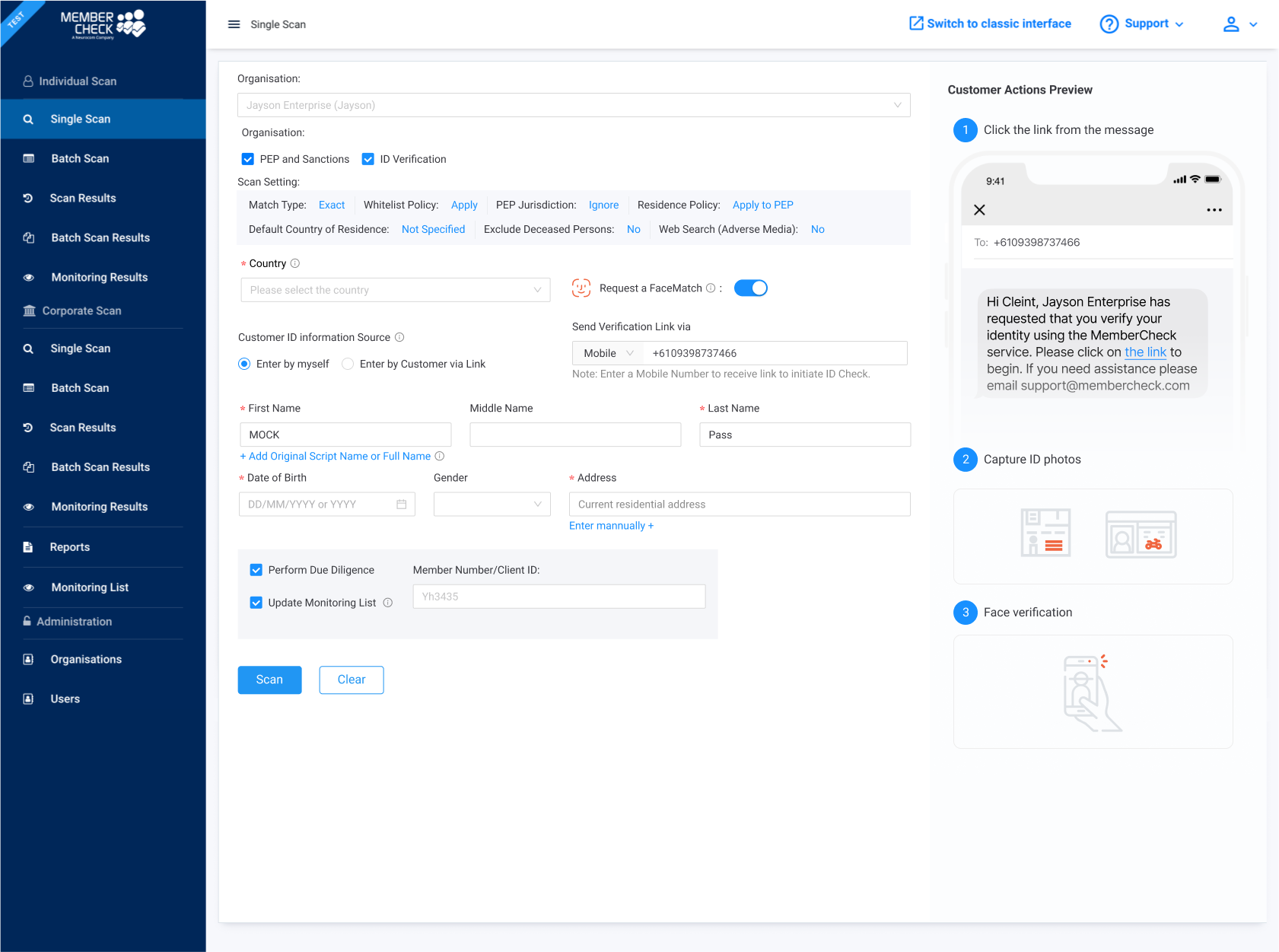
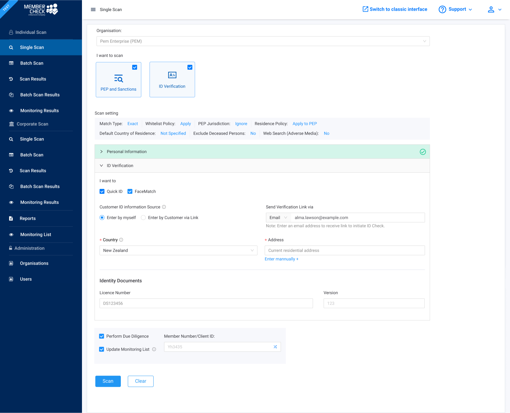
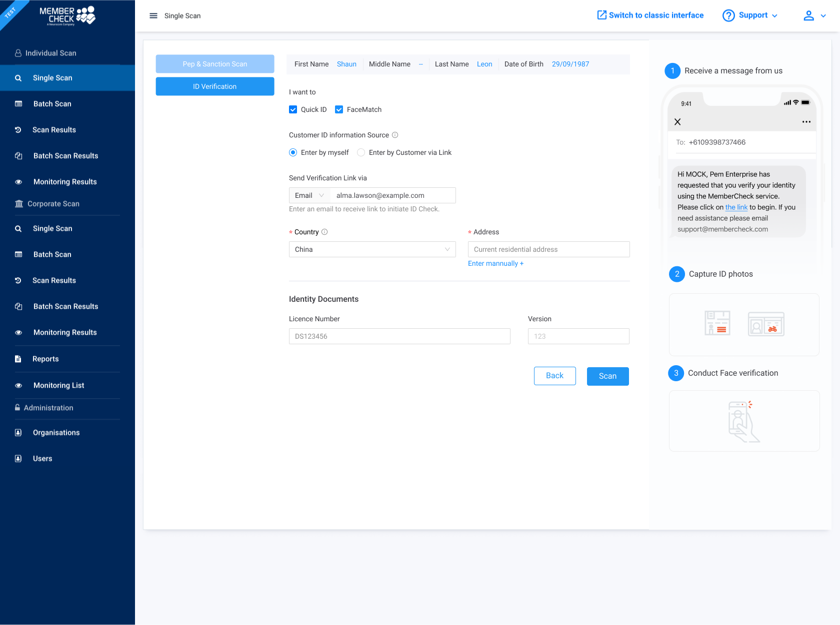
Design Explorations

Here are some initial design concepts we explored in the early stage (But didn't go with It)

01

Exploration 1 - Add the IDV checkbox to existing workflow

In the new IDV workflow, I just added a checkbox that allows users to check or uncheck the ID Verification option on the Scan page. When IDV is checked, relevant fields are shown, and they are hidden when unchecked.

Still overwhelming with settings and fields to complete

Too many thing to show user to complete at once

02

Exploration 2 - Group the required fields by Collapse

I made the scan options a small card for users to check or uncheck, as the checkbox on the scan option card is quite important in the visual hierarchy and can determine the required fields display to the users.

Prompt the user to select the type of scan they would like to perform

A much more organised and clearer layout than the previous design

No description of the service, which may not be beginner-friendly

Customer actions preview diagram hard to be implement in this layout  

01

Exploration 3 - Tab Service Selector

I added a left-hand tab menu for switching between screening services, showing only relevant fields to reduce clutter. However, the design is not intuitive, as the layout feels overwhelming, and the tab lacks prompts or clear indicators, which may confuse users.

Not Intuitive enough

Users may not realise they can select two tabs simultaneously

Not scalable – adding features later may overwhelm users.

final DESIGN Deliverable

High Fidality Wireframes

After gathering insights from personas, user interviews, usability interview, and the user journey map, I started designing the high-fidelity wireframe in Figma.
I used sticky notes in the Figma file to explain my design rationale.

01

Modern UI

We've transitioned our classic user interface to a legacy system, reinforcing our commitment to improving the MemberCheck experience and driving innovation.

02

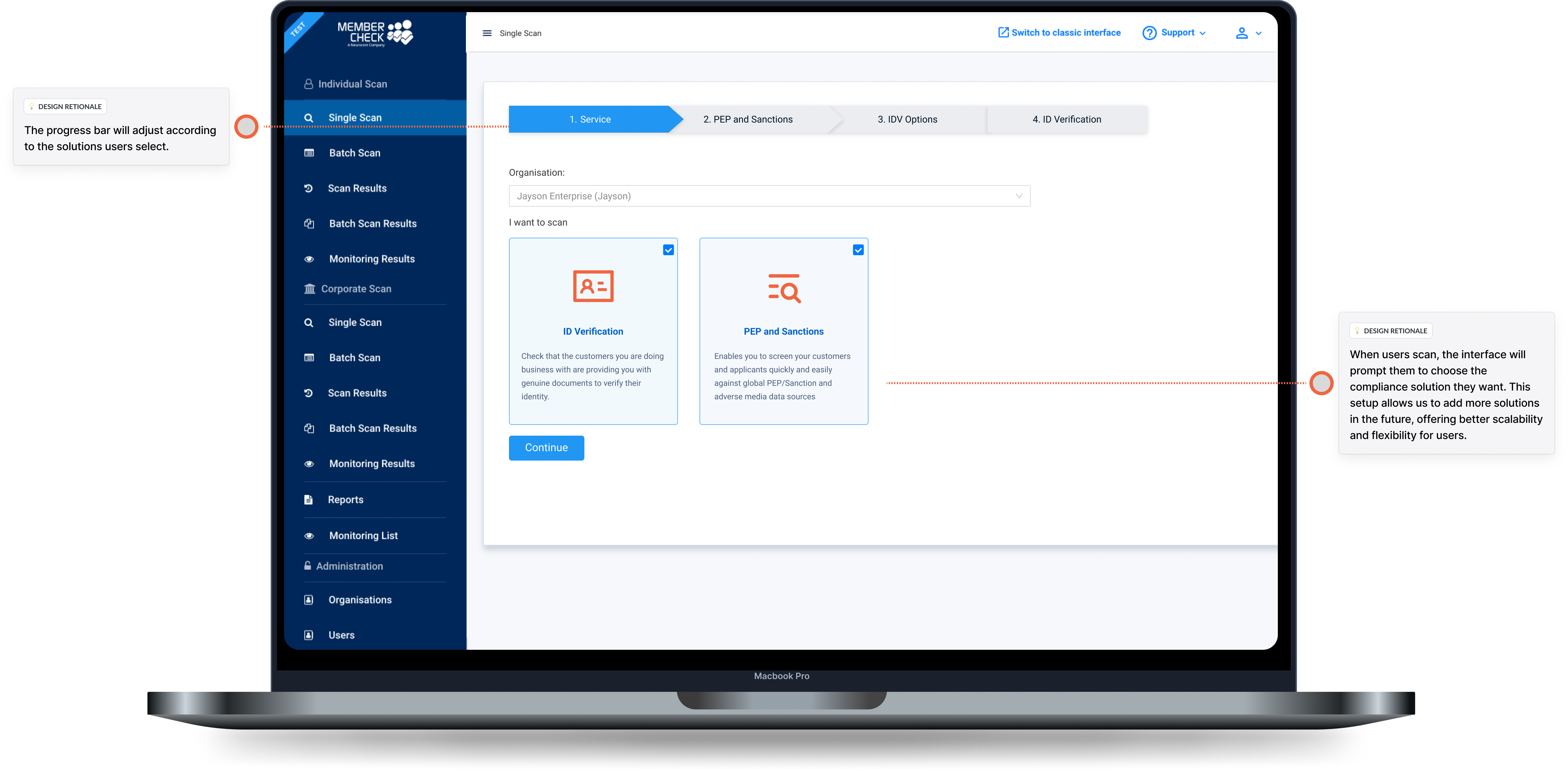
Stepped Wizard Design

MemberCheck’s ID verification uses a step-by-step wizard, simplifying the process by clearly breaking down each stage. This design helps users navigate easily, track progress, and stay informed, enhancing trust and the overall experience.

03

Enhanced Scalability
The new workflow lets users select the checks they need upfront, with subsequent steps adjusting automatically. This improves usability, enables combined PEP & Sanction Checks with ID Verification, and accommodates future features like visa checks or police checks. The process is now more efficient, user-friendly, and scalable.

04

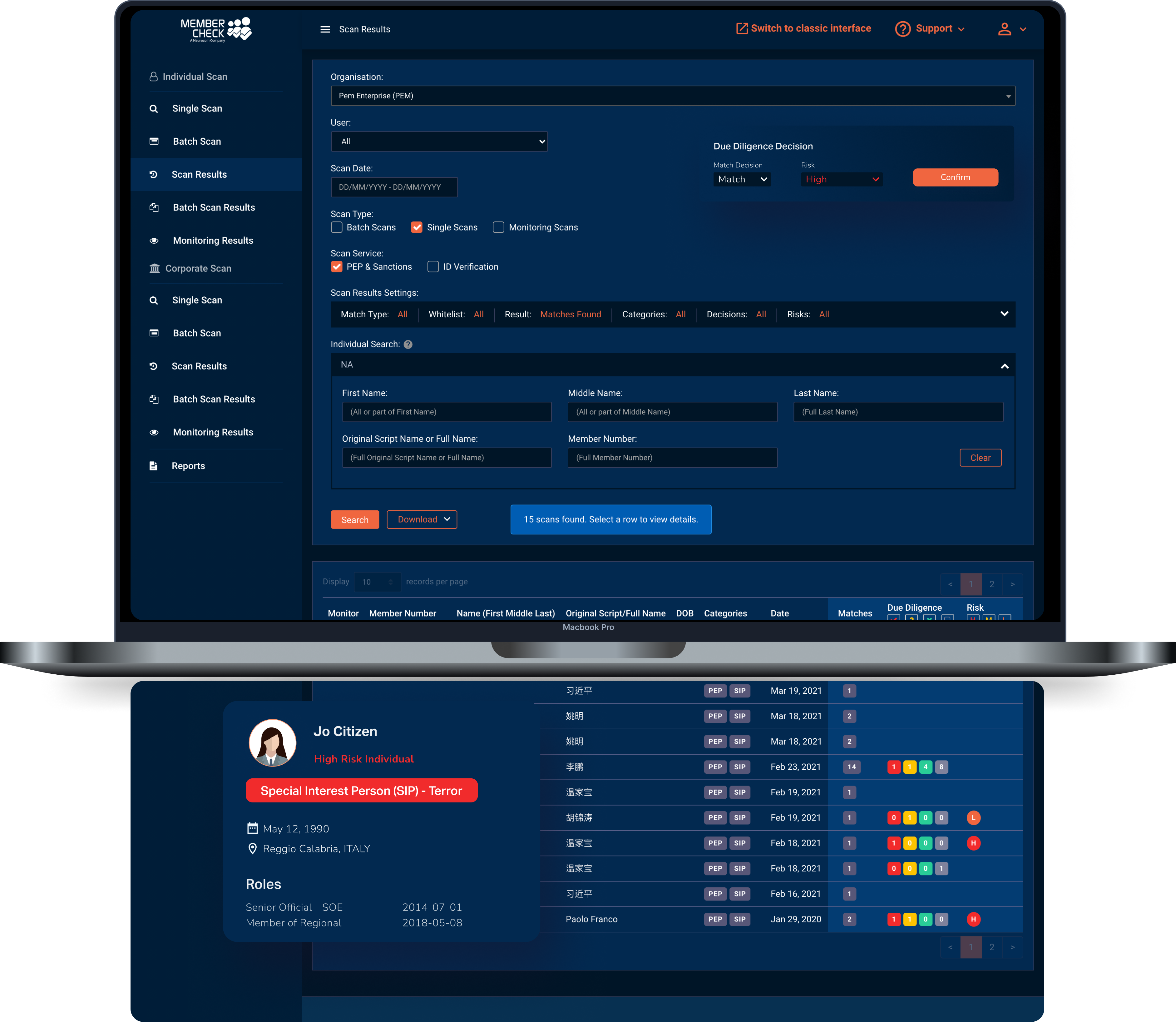
Dark Mode

Added a "Dark Mode" feature, allowing users to switch between light and dark themes for better visibility, reduced eye strain in low-light settings, and a more comfortable, personalised experience.

Customisable Experience: Users can choose between light mode or Dark Mode for a tailored experience.

Better Accessibility: Dark Mode is easier on the eyes for those with light sensitivity or visual impairments.

Aesthetic Appeal: The sleek look of Dark Mode aligns with modern design trends, giving the interface a professional, subdued style for those who prefer it.

STARTING THE DESIGN

Accessibility

Designing for accessibility benefits everyone by considering all users' journeys, including those with disabilities—permanent, temporary, or situational.

Colour contrast

The page follows WCAG AAA guidelines, ensuring a 7:1 contrast ratio for normal text and 4.5:1 for large text. This improves readability for users with low vision or colour blindness and in different lighting conditions.

Font Size

The desktop version uses a 16px base font, while the mobile version increases to 18px for clarity on smaller screens, supporting text resizing up to 200% without functionality loss.

Responsive Design

The MemberCheck application is fully optimised for responsiveness, providing a seamless experience across all devices and screen sizes. The layout adapts fluidly for desktops & tablets,, ensuring clarity, usability, and compatibility with assistive technologies.

tHE rESULT

Project Outcome

The new Identity Verification (IDV) and UI improvements have significantly boosted key business metrics and user engagement.

-50% Reduction in
User-Reported Confusion

Streamlining the workflow process reduced steps, cutting user confusion by 50% and making the journey clearer and easier to navigate.

-50% Less Customer Support Queries

The new design reduced customer support queries about the verification process by 50%, demonstrating improved clarity and user-friendliness, enabling users to complete tasks more independently.

40% Positive User Feedback Surge

User satisfaction ratings saw an 40% positive feedback rate across platforms like Capterra, Software Advice, and GetApp, specifically praising the application's ease of use. This highlights a significant improvement in user experience following recent enhancements.

Enhanced Scalability
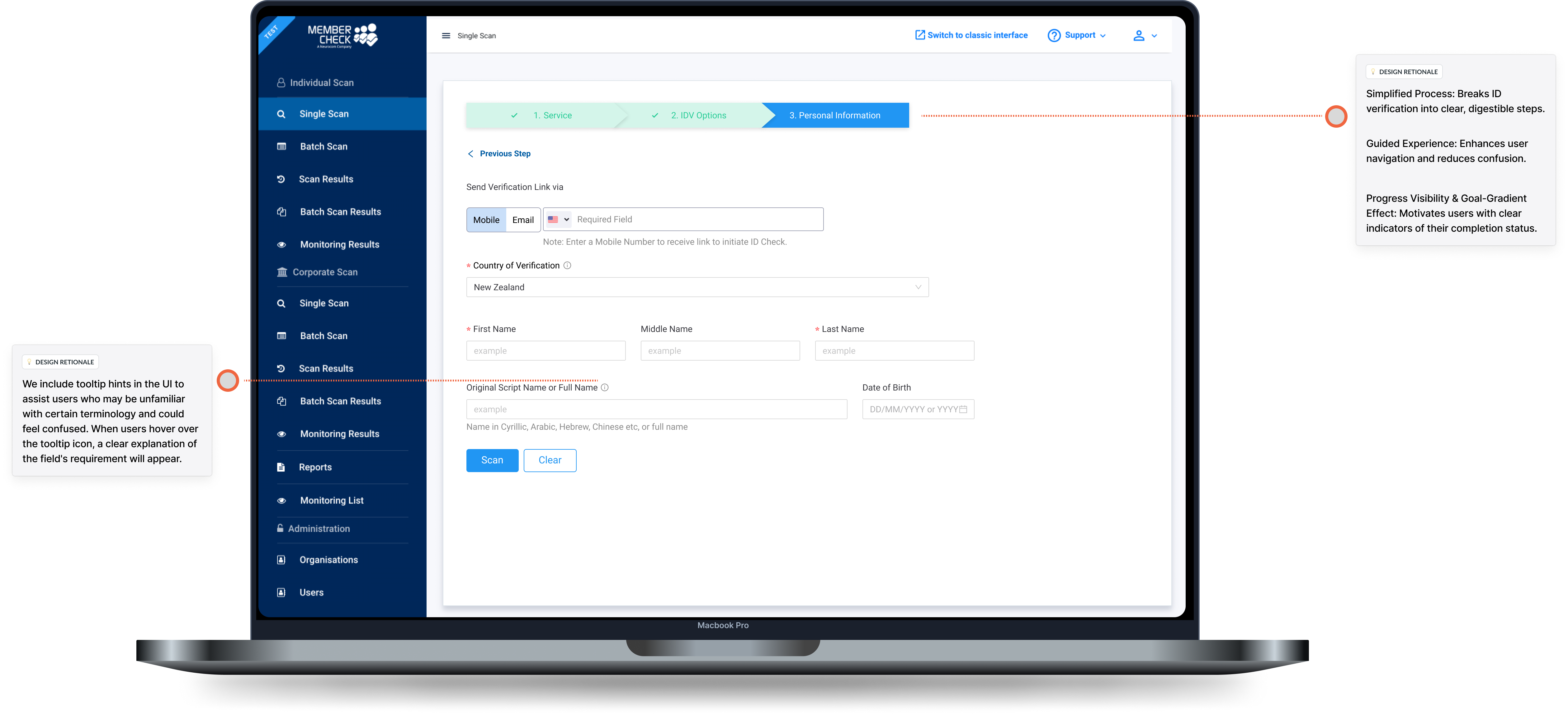
he stepped wizard was designed for scalability, using a modular approach to adapt to growth and evolving needs. This ensures a consistent and reliable user experience as MemberCheck expands.

Lessons learned

Takeaway


Went Well

  • Delivered clear and aligned design specifications to developers seamlessly.
  • Successfully launched the MVP and deployed it to production.

To improve

  • Implementation is time-consuming due to technical constraints and third-party vendor limitations.

- Project Overview -

01 | Project Objective

To create a solid base with our Minimum Viable Product (MVP) that satisfies our initial launch criteria—including essential IDV functionality—while ensuring a smooth expansion pathway for future features.

02 | Role & Deliverables

In this project, my role encompassed the complete UX and UI design process, working collaboratively with a Project Manager, two developers and another designer. My responsibilities ranged from identifying and defining the core problem to delivering the final visual designs, ensuring a seamless end-to-end user experience.

03 | Challenges

This project involved numerous technical dependencies across different teams and products, requiring careful coordination and prioritisation. Our goal was to efficiently manage these complexities to ensure the on-time delivery of a Minimum Viable Product (MVP).

04 | Outcome & Impact

We successfully launched the MVP within a six-month timeframe, resulting in a significant improvement in our overall metrics.

  1. +20% Increased User Completion Rates
  2. -50% Reduction in User-Reported Confusion
  3. -60% Less Customer Support Queries
  4. +80% Positive User Feedback Surge
  5. Accelerated Development Cycles
  6. Enhanced Scalability
2024 © All Rights Reserved.

- Project Overview -

01 | Project Objective

To create a solid base with our Minimum Viable Product (MVP) that satisfies our initial launch criteria—including essential IDV functionality—while ensuring a smooth expansion pathway for future features.

02 | Role & Deliverables

In this project, my role encompassed the complete UX and UI design process, working collaboratively with a Project Manager, two developers and another designer. My responsibilities ranged from identifying and defining the core problem to delivering the final visual designs, ensuring a seamless end-to-end user experience.

03 | Challenges

This project involved numerous technical dependencies across different teams and products, requiring careful coordination and prioritisation. Our goal was to efficiently manage these complexities to ensure the on-time delivery of a Minimum Viable Product (MVP).

04 | Outcome & Impact

We successfully launched the MVP within a six-month timeframe, resulting in a significant improvement in our overall metrics.

  1. +20% Increased User Completion Rates
  2. -50% Reduction in User-Reported Confusion
  3. -60% Less Customer Support Queries
  4. +80% Positive User Feedback Surge
  5. Accelerated Development Cycles
  6. Enhanced Scalability